Questa pagina non è una pagina ufficiale dell'app o del suo sviluppatore, ma una pubblicazione editoriale indipendente creata a scopo informativo e di commento. Salvo espressa indicazione contraria, né l'app né il suo sviluppatore sono affiliati, approvati, sponsorizzati, autorizzati o altrimenti ufficialmente collegati a MWM, Apple, Google Play, all'editore dell'app o allo sviluppatore dell'app, e nulla in questa pagina implica che l'app sia stata sviluppata utilizzando i servizi di MWM. Tutti i marchi, loghi, screenshot e altri contenuti rimangono di proprietà dei rispettivi proprietari.

Teaching Graphs
Dai ai tuoi studenti la possibilità di visualizzare il loro mondo. Dai diagrammi di Venn ai grafici a torta, Teaching Graphs rende la comprensione dei dati divertente e accessibile ai giovani studenti, senza la complessità dei fogli di calcolo.
Download
87K+Valutazione
Valutazioni totali
0Editore
Categoria
EducationLingue
1Ultima versione
1.43Dimensione
18.4 MBData di lancio
23 ago 2012Dai ai Giovani Menti il Potere di Comprendere i Dati
Un ambiente privo di distrazioni in cui gli studenti si concentrano sulla logica dei grafici piuttosto che sulla complessità del software professionale.
Creazione di Grafici Senza Sforzo
Salta i fogli di calcolo. Gli studenti creano colorati diagrammi di Venn, Carroll e a Torta con intuitivi strumenti di trascinamento.
Lettura di Dati dal Mondo Reale
Sviluppa il pensiero critico interpretando dati meteorologici in tempo reale e set di dati pertinenti, progettati per i primi studenti.
Gli screenshot e la descrizione seguenti provengono direttamente dall'elenco ufficiale dello store dell'app e sono di proprietà dello sviluppatore.
App Store
Screenshot
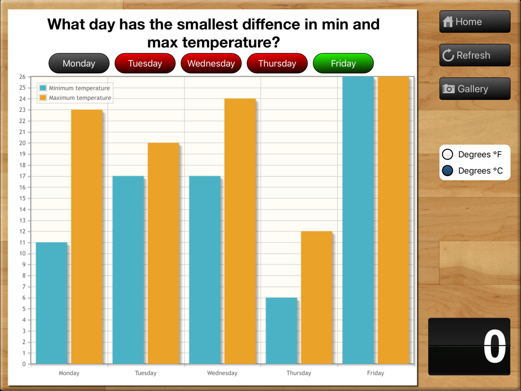
Un grafico a barre educativo che mostra i confronti delle temperature minime e massime per una settimana scolastica di cinque giorni.
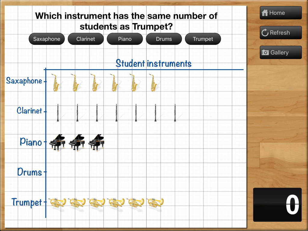
Un grafico pittorico che mostra i dati sugli strumenti degli studenti su una griglia all'interno dell'app Teaching Graphs per iPad
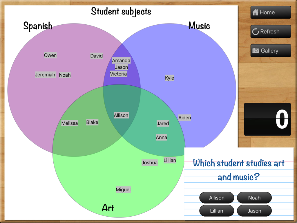
Un diagramma di Venn a tre cerchi nell'app Teaching Graphs utilizzato per interrogare gli studenti sulle categorie sovrapposte di Spagnolo, Musica e Arte.
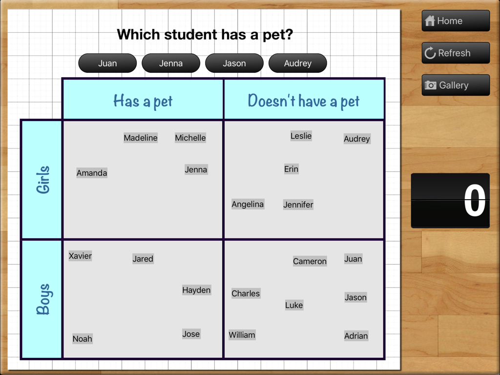
Un'attività di diagramma di Carroll nell'app Teaching Graphs che mostra una griglia per ordinare ragazzi e ragazze in base al possesso di animali domestici.
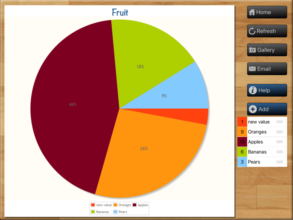
Un grafico a torta a tema frutta creato nell'app educativa per iPad Teaching Graphs che mostra dati su mele, arance e banane.
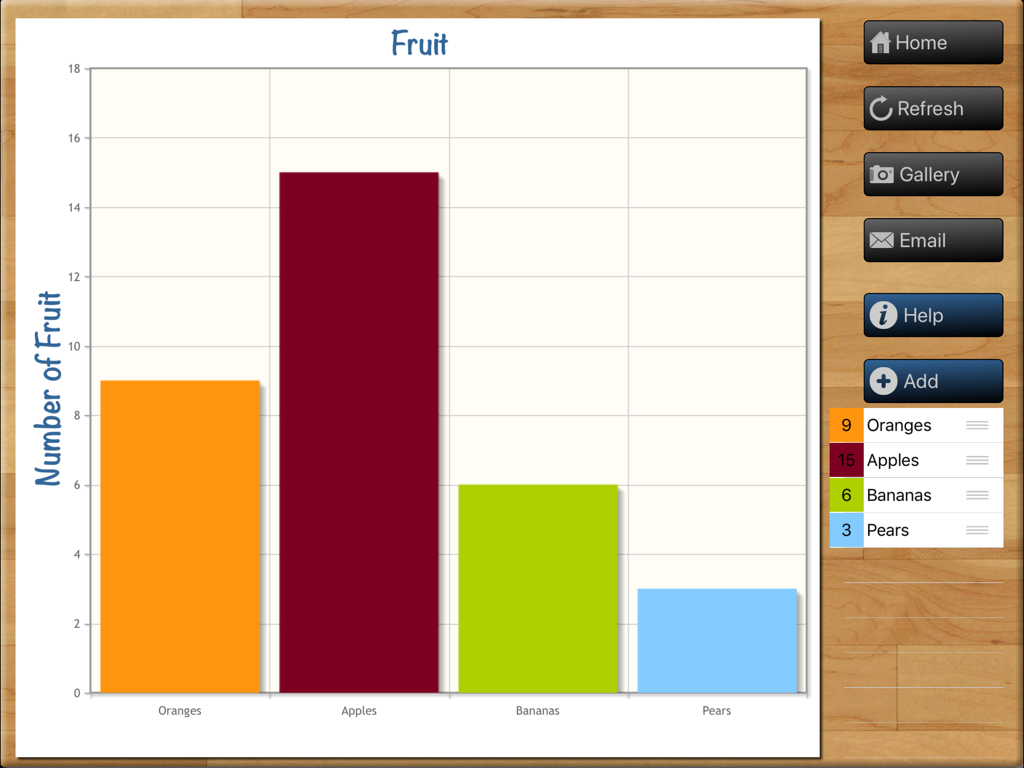
Un colorato grafico a barre intitolato Frutta nell'interfaccia dell'app Teaching Graphs su un iPad
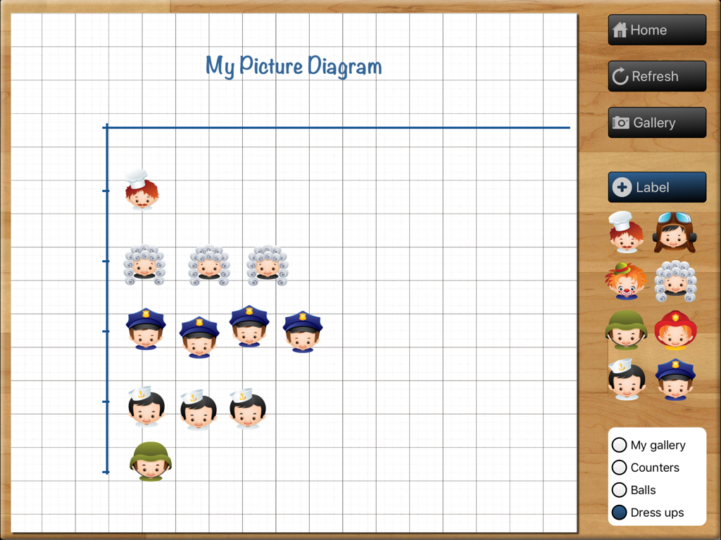
Interfaccia dell'app Teaching Graphs che mostra un creatore di grafici pittografici con icone di personaggi su una griglia
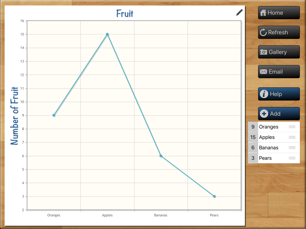
Un grafico a linee che mostra il conteggio della frutta nell'interfaccia dell'app Teaching Graphs per iPad
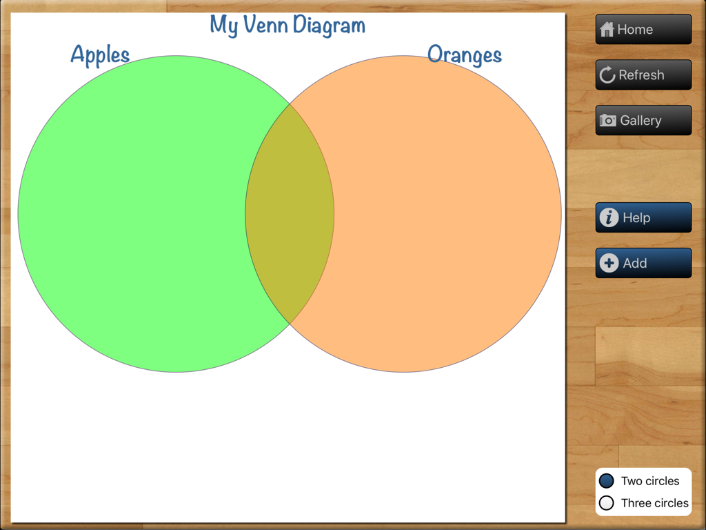
Interfaccia dell'app Teaching Graphs per la creazione di un diagramma di Venn con due cerchi sovrapposti etichettati Mele e Arance.
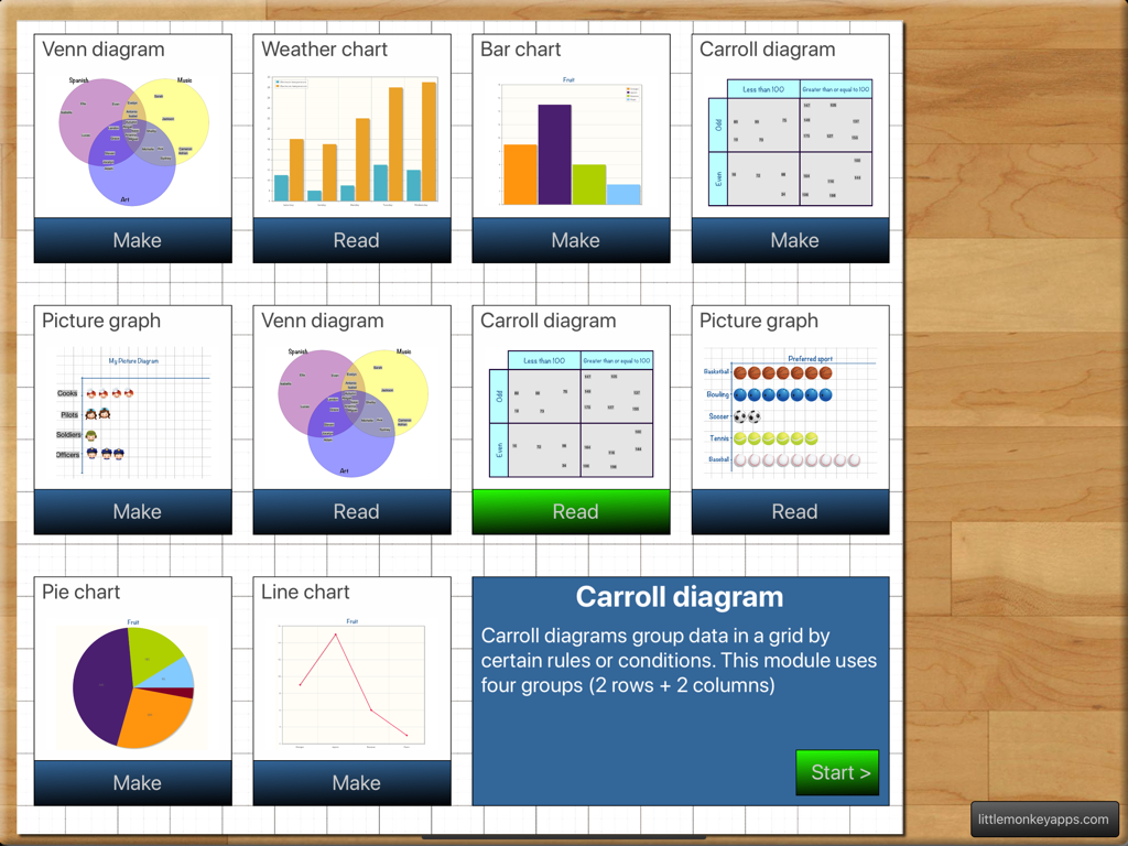
Il menu principale dell'app Teaching Graphs che presenta vari tipi di grafici e diagrammi che gli studenti possono leggere o creare.
Descrizione
Download
App Simili
App più classificate nella stessa categoria

Duolingo - Language Lessons
Duolingo, Inc

Speak & Learn English: Learna
DEEP FLOW SOFTWARE SERVICES - FZCO

驾考宝典-科一科四驾驶证考试驾考通
Wuhan Jiakaobaodian Information Service Co., Ltd.

Toca Boca World
Toca Boca AB

Google Classroom
Google LLC

作业帮-中小学家长作业检查和辅导工具
Guangzhou Polar Future Culture Technology Co., Ltd

学信网
Student Information Consultation Service Co., Ltd.

Gauth: AI Study Companion
GAUTHTECH PTE. LTD.

ArtWorkout: Learn How to Draw
Aleksandr Ulitin
Questa pagina non è una pagina ufficiale dell'app o del suo sviluppatore, ma una pubblicazione editoriale indipendente creata a scopo informativo e di commento. Salvo espressa indicazione contraria, né l'app né il suo sviluppatore sono affiliati, approvati, sponsorizzati, autorizzati o altrimenti ufficialmente collegati a MWM, Apple, Google Play, all'editore dell'app o allo sviluppatore dell'app, e nulla in questa pagina implica che l'app sia stata sviluppata utilizzando i servizi di MWM. Tutti i marchi, loghi, screenshot e altri contenuti rimangono di proprietà dei rispettivi proprietari.