This page is not an official page of the app or its developer, but an independent editorial publication created for informational and commentary purposes. Unless expressly stated otherwise, neither the app nor its developer is affiliated with, endorsed by, sponsored by, authorized by, or otherwise officially connected with MWM, Apple, Google Play, the app publisher, or the app's developer, and nothing on this page implies that the app was developed using MWM's services. Any trademarks, logos, screenshots, and other content remain the property of their respective owners.

CONTRAST - Color Accessibility
Ensure your digital products meet WCAG standards with precision. The ultimate mobile companion for UI/UX designers and developers to validate color contrast and build accessible experiences.
Downloads
23K+User Rating
Total Ratings
0Publisher
Category
Graphics & DesignLocales
9Latest Version
2.1.0Size
4.3 MBFirst Released
Oct 18, 2019Design with Confidence and Inclusivity
Ensure your digital products meet WCAG 2.0 standards with a precision tool built for designers and developers who value accessibility.
Instant WCAG Validation
Accurately measure contrast ratios against international guidelines to ensure your UI is readable for everyone and legally compliant.
Pro-Grade Color Inputs
Work with Hex, RGB, HSB, and CMYK to seamlessly bridge the gap between your design system and technical development workflow.
The following screenshots and description are sourced directly from the app's official store listing and are the property of the app developer.
App Store
Screenshots
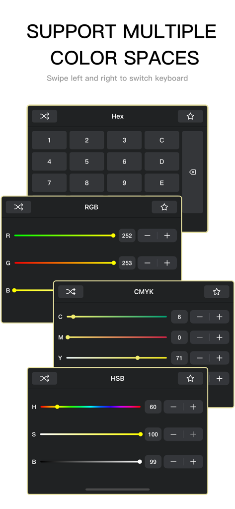
Mobile app interface showing Hex RGB CMYK and HSB color input keyboards
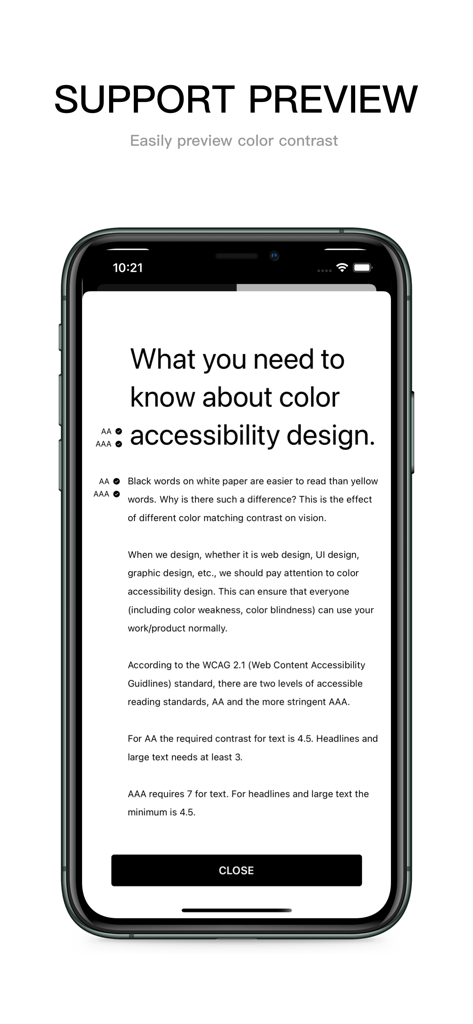
Educational screen in the CONTRAST app explaining WCAG color accessibility standards and contrast ratios.
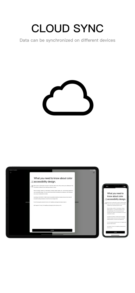
Cloud sync feature showing color accessibility design guidelines on iPhone and iPad
Description
Download
More Like This
Top-ranked apps in the same category

Kling AI: AI Image&Video Maker
LOHAS GAMES PTE. LTD.

iScreen - Widgets & Wallpaper
Xiamen ShenZhuo Information Technology Co., Ltd.

Dreamina AI: Image&Video Maker
BYTEDANCE PTE. LTD.

Home AI - AI Interior Design
HUBX YAZILIM HIZMETLERI ANONIM SIRKETI

ibis Paint X
ibis inc.

ThemeKit: Widget & Icon Themes
Woohoo Tech. Ltd.

Sketchbook®
Sketchbook, Inc.

Colorful Widget- Widget&Themes
Guangzhou ZHIFENG Information Technology Co.,Ltd.

ReRoom AI: Interior Design
GM UniverseApps Limited
This page is not an official page of the app or its developer, but an independent editorial publication created for informational and commentary purposes. Unless expressly stated otherwise, neither the app nor its developer is affiliated with, endorsed by, sponsored by, authorized by, or otherwise officially connected with MWM, Apple, Google Play, the app publisher, or the app's developer, and nothing on this page implies that the app was developed using MWM's services. Any trademarks, logos, screenshots, and other content remain the property of their respective owners.